It’s certainly been a journey to adjust to work life in lockdown. We’re very fortunate that our team can work from home, and that everyone and their families are safe and healthy. We’ve been been adapting to working from home but one big issue has been finding virtual alternatives to the parts of our development process that depend on a physical space.
We’re a small team, almost entirely in one room, though we did hire our first remote engineer before lockdown (you may have noticed Nate author a recent post). We follow the common sprint process you find at most software companies, with one unique but important addition: the first thing we did when we moved into our office was install a giant whiteboard.
Nope, not for doodling (though it occasionally stands in for that). This whiteboard controls our entire day to day. It’s filled with sticky notes in different boxes, capturing what everyone’s working on and what’s top of mind. We do our sprint planning on it, and every daily standup in front of it.
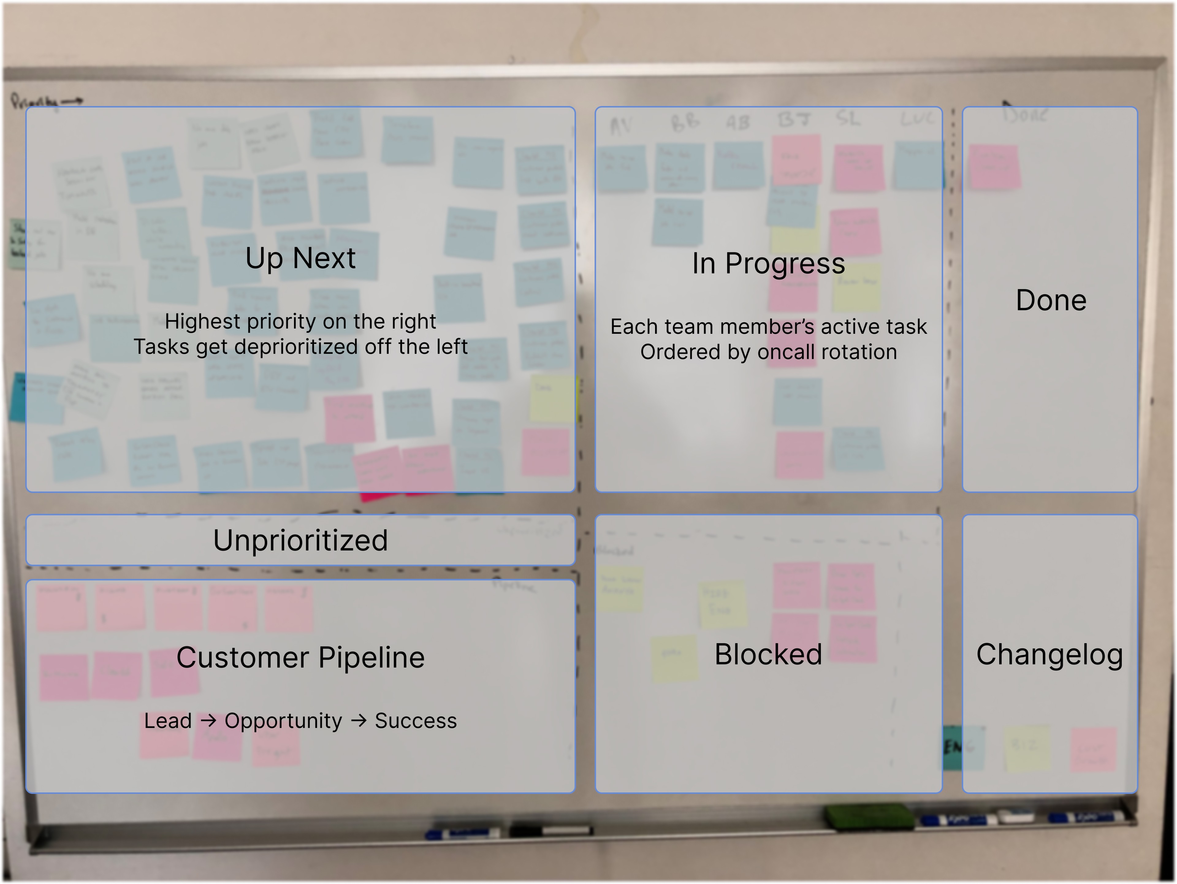
The board captures a lot more than just engineering work items however. We’ve designed this board to help us manage everything that goes into building our product & our company. To do that, we divided our board into multiple sections, each capturing a different piece of information:
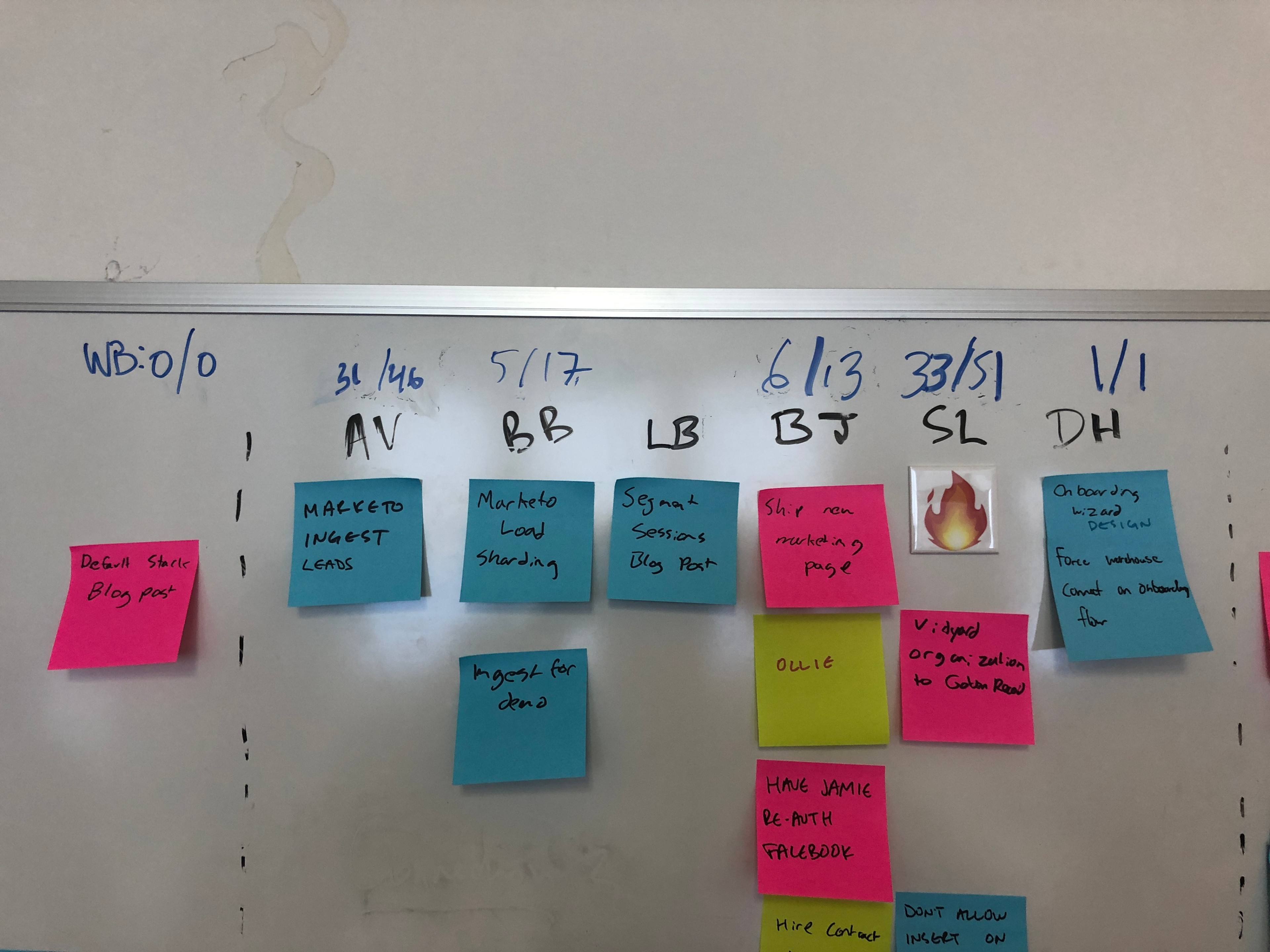
- Who’s working on what at any given time - the list is sorted by our oncall rotation (and also includes our office fly swatting batting averages, critical detail).
- Prioritized “Up Next” tasks, reprioritized every week during sprint planning - Tasks that don’t fit in Up Next are kicked off the board. This physical constraint is an amazing feature, more on this in a moment. I would usually take a picture when this happened to add them to our historical record.
- Blocked and Done tasks, as well as tasks that should end up in our Changelog.
- Unprioritized tasks that were generated during the previous week and get prioritized during weekly sprint planning.
- Recent customer pipeline - Great for both sales and customer success. We use this to ensure we’re not forgetting critical features or bugs.
There are two crucial aspects to this board that we've come to love in particular.
- The board is filled with sticky notes that span any kind of significant work someone on the team is doing, which includes tasks like writing this blog post or dealing with legal paperwork. We use color to differentiate between engineering, sales, and business operations.
- The board is physically restricted in two dimensions, which means we can’t have an infinite number of items in the queue nor can we have all the items piled up in the “highest priority” side of the board.
Because of these two factors we are forced to stay focused and maintain priorities across everything that we do. The board cannot grow in size and there’s always competing priorities. And since we put all kinds of work on the board, we don’t have a separate list of work items that can sneak by. The forcing function that comes from physically dropping an item that doesn’t fit on the board is painful but also a necessary acknowledgment that our team can only do a limited number of things.
This huge physical board is very expressive and infinitely customizable, and it has been hard for us to let it go. When we added our first remote engineer, we struggled to digitize it. Before COVID-19, our plan was to set up a permanent, high-resolution webcam so it could be referenced remotely though not updated (we once looked into automatic sticky printing but that’s a story for another day).
Then came San Francisco’s Shelter-In-Place directive. The last person out of the office took a picture of the board and shared it in Slack. That worked for a couple days. But we needed to find a virtual alternative to our beloved board. We’d been playing with Linear so I converted all the whiteboard stickies to Linear tasks and hoped it would be just as good.
Narrator: It wasn’t.
To be clear, this isn't a criticism of Linear. It’s a universal problem with project management software: none of them prevents the sprawl of unlimited tasks.
A recent Hacker News thread about Spatial Interfaces had been making the rounds and it made me realize all these task tracking tools were missing the spatial affordances we had organically created with the whiteboard.
So with a little time on the weekend, I learned Linear’s GraphQL API, and used Vue and Netlify to build Deck Chairs: an attempt at capturing the spatial task organization we had created on the whiteboard. It replicates some of the sections from our physical whiteboard, and represents tasks as stickies with a real screen size. If there’s too many on the board, the tasks “fall off” and are automatically pushed to a hidden wishlist/backlog stored in Linear, but not visible anywhere on Deck Chairs.
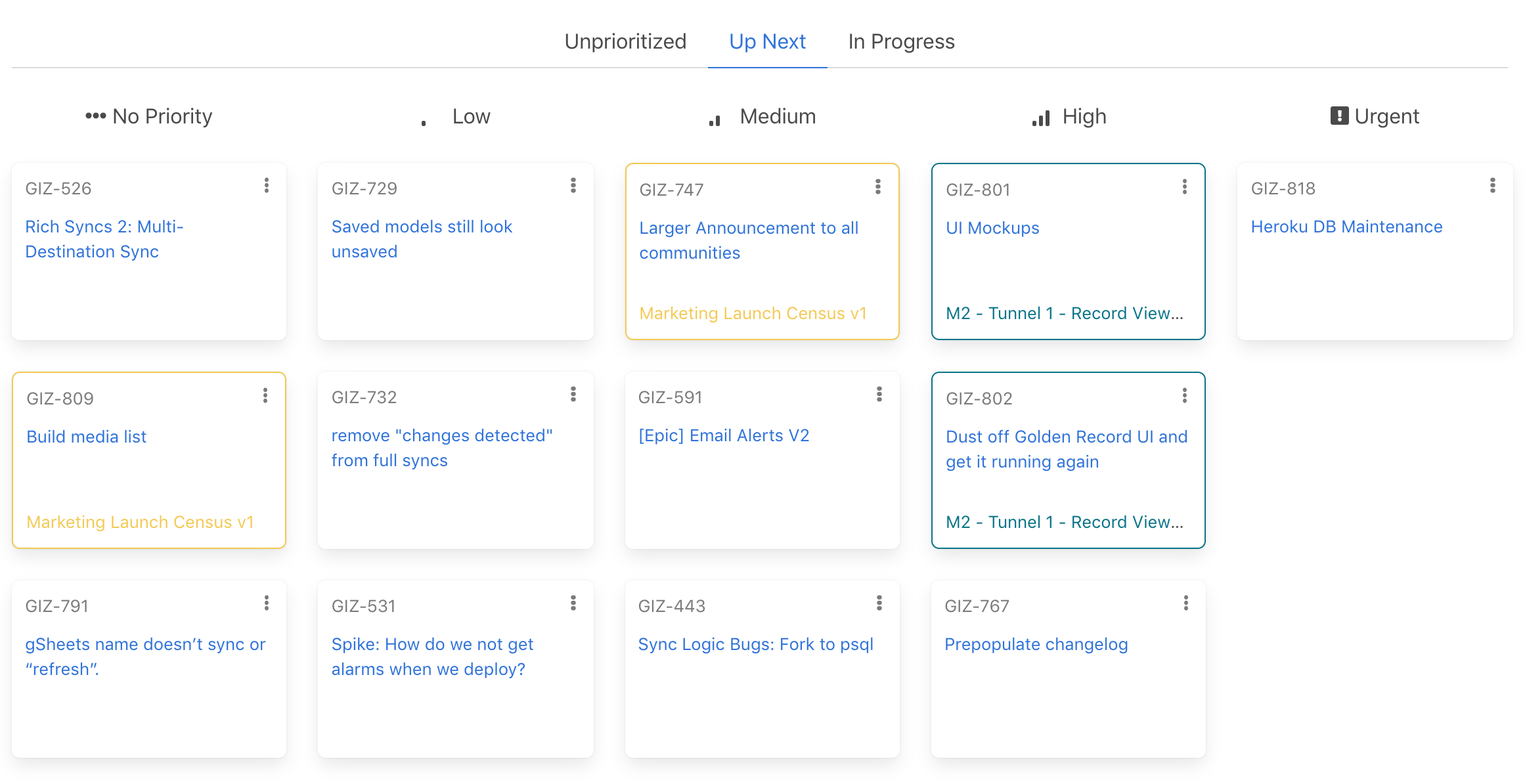
So far, we’ve converted three sections of our board
- Our Up Next section of prioritized tasks, which allows drag and drop reprioritization of tasks
- Our In Progress section, showing who’s working on what
- Our Unprioritized section that gets triaged every week into Up Next or Backlog
But this is only a step toward recreating our whiteboard virtually. The process of creating a new section still requires me to write code to define what data to load and how it’s arranged. A better solution would allow for simple new creations of sections and the associated rules. Imagine the Tabletop Simulator of whiteboards, something it seems Whimsical and Miro are trying to do. I’m keeping an eye on them and when they become more data-aware, it might make sense for us to switch. At least so we can get doodles back.
It’s already cliché, but Deck Chairs is another indicator for me that there’s lots of opportunity to translate our existing physical processes into digital tools. I’m really excited about Miro, and people doing crazy things with Figma, and experiments like Online Town, and I hope one of them will make me miss our whiteboard a little less.
P.S. Follow us on Twitter to stay tuned for more on how we're making remote work easier for a team that loves its office.

